Inline Buttons - Desktop
Jump to:
Step 1: Choose Social Networks
Step 2: Color Scheme Settings
Step 3: Display Settings
Step 4: Share Count Settings
Step 5: Advanced Placement Settings
About Inline Buttons
Inline buttons are horizontal buttons that display within the content of your posts, pages, and custom post types. These are the most common sharing buttons you'll encounter when browsing other websites and blogs.
The inline buttons are optional but you will likely want to enable them on your site.
Button Preview
 The settings screen for the inline buttons includes a preview at the bottom of the screen. Click Show to see a live preview of your buttons that will update instantly to reflect any changes you make, or Hide to close the Preview. This is a handy tool to make sure the buttons look the way you want before you save settings.
Step 1: Choose Social Networks
The first step in configuring the inline buttons is choosing which social network buttons you want to display:

When you click Activate Networks, you will see various buttons depending on whether you're using Social Rocket or Social Rocket Pro.
Social Rocket:

Social Rocket Pro:
 Check the boxes to select your desired buttons, then click the Apply Selection button. Your chosen buttons will display along with a few options:

To reorder the buttons, click and hold the hamburger icon on the left side, then drag and drop the buttons into your desired order.
To remove a button, click the Remove button on the right side.
To add more buttons, click Activate Networks again to reopen the button selection panel.
For more options, click the Advanced button.
Advanced Button Options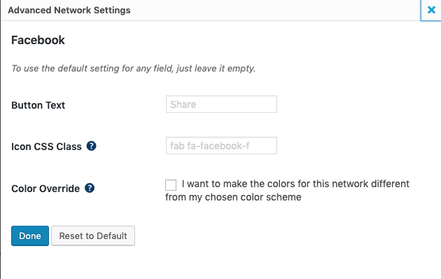

The Advanced button opens a modal to allow you to change individual button settings:
Button Text: This is the optional text displayed on the button, such as Share or Tweet. You can edit this text to say anything you'd like.
Icon CSS Class: Social Rocket uses FontAwesome for the various social network icons. If you'd like to use a different FontAwesome icon for a particular button, you can enter the class in this field. You can also enter a completely custom CSS class and choose your own icon via your theme's stylesheet.
Color Override: If you want to change the colors of this button only, you can do so here. This will override any general settings for colors that you choose later.
Step Two: Color Scheme Settings
Social Rocket allows three main options for Color Scheme - default, inverted, or custom.
The default setting displays typical social buttons in the colors of each social network.
The inverted setting displays the button icon and text in the colors of each social network, with a white background.
The custom setting allows you to choose exactly what color the buttons will be:

The custom color scheme will apply to all buttons unless you have used the Advanced button next to a particular network to change its colors.
Step Three: Display Settings
Left Column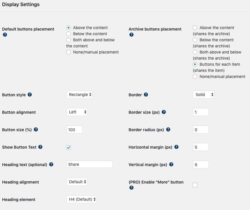

Default buttons placement: This is the baseline placement of the inline buttons throughout your site. You can fine-tune this later for individual post types, pages, etc. in the advanced placement settings. Options are:
- Above the content
- Below the content
- Both above and below the content
- None/manual placement (manual placement means you will position the buttons yourself via shortcode or PHP function)
Button style: This is the shape of the buttons. Options are:
- Oval
- Rectangle
- Round
- Square
Button alignment: This is the location of the buttons on the screen. Options are:
- Left
- Center
- Right
- Stretch (centered but stretched to fill the entire screen) - this option is available for the Rectangle and Oval styles
Button size (%): Adjust the button size based on a default of 100%.
Show Button Text: If this box is checked, each button will feature text like "Share" or "Pin." You can customize the text for an individual button by scrolling back to Choose Social Networks and clicking the Advanced button next to the network.
If the box is unchecked, the buttons will display only the social network icon with no text.
Heading text (optional): If you'd like to display a heading above your buttons, such as "Share this!" or "Sharing is caring", you can add it here.
Heading alignment: This option changes the location of the heading. For example, if your buttons are centered, you may want to center the heading as well.
Heading element: Choose whether your heading will be H1, H2, H3, H4 (default), H5, H6, or be enclosed in paragraph tags.
Right Column
Archive buttons placement: This is the baseline placement of the inline buttons throughout the archives on your site. You can fine-tune this later for individual archives in the advanced placement settings. Options are:
- Above the content (shares the archive)
- Below the content (shares the archive)
- Both above and below (shares the archive)
- Buttons for each item (shares the item)
- None/manual placement (manual placement means you will position the buttons yourself via shortcode or PHP function)
Border: What type of border you'd like on your buttons. Options include:
- None
- Solid
- Double
- Dashed
- Dotted
- Inset
- Outset
- Groove
- Ridge
Border size (px): If you display a border, you can choose how many pixels the border will be.
Horizontal margin (px): Choose the amount of horizontal space between buttons.
Vertical margin (px): Choose the amount of vertical space below each button.
(PRO) Enable "More Button": This enables a special button that allows you to hide buttons until the More button is clicked. This can be a great space saver if you want to display a large number of sharing buttons. The More button is offered in Social Rocket Pro only - it isn't available in the free plugin.
Step 4: Share Count Settings

Show share count: Whether or not to display share counts (for networks that support counts) on your sharing buttons.
Minimum shares: Set a minimum number for displayed share counts. Any counts below this number won't be displayed.
Round large share counts: Display large counts in a shorter format. For instance, 1,000 shares would be shortened to 1K.
Show total share count: Whether or not to display the total number of shares for the post/page being viewed.
Minimum total: Set a minimum number for displayed total shares. Any total below this number won't be displayed.
Total share count position: Choose whether the total will display before or after the inline buttons.
Total share text/icon color: Choose the color of the total share count text and/or icon.
Show total share icon: Choose whether to display the universal share icon next to the share count total.
Step 5: Advanced Placement Settings

In this section, you can adjust the placement of the inline buttons for individual post types, archive types, or CPTs. The Default setting will utilize whatever you selected in the Display Settings section, or you can make adjustments. You can also change the placement on a per-post or per-page basis in the Social Rocket Post Options.